About the project
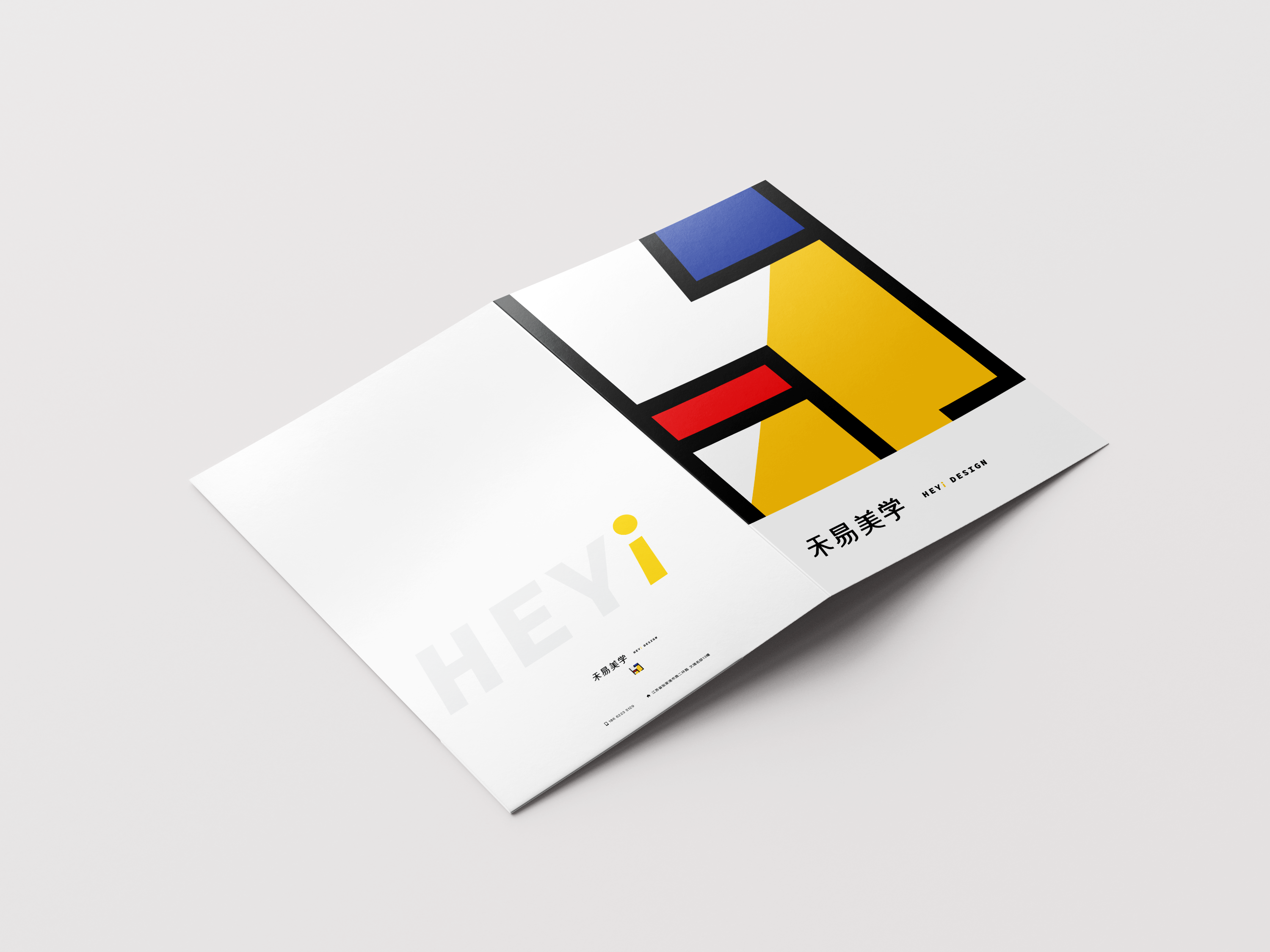
I was tasked with rebranding He Yi Design, a Chinese interior design company. Their Chinese name is “禾易美学” (Hé Yì Měi Xué). The original logo had a classic oriental appearance, but my client desired a more contemporary aesthetic.
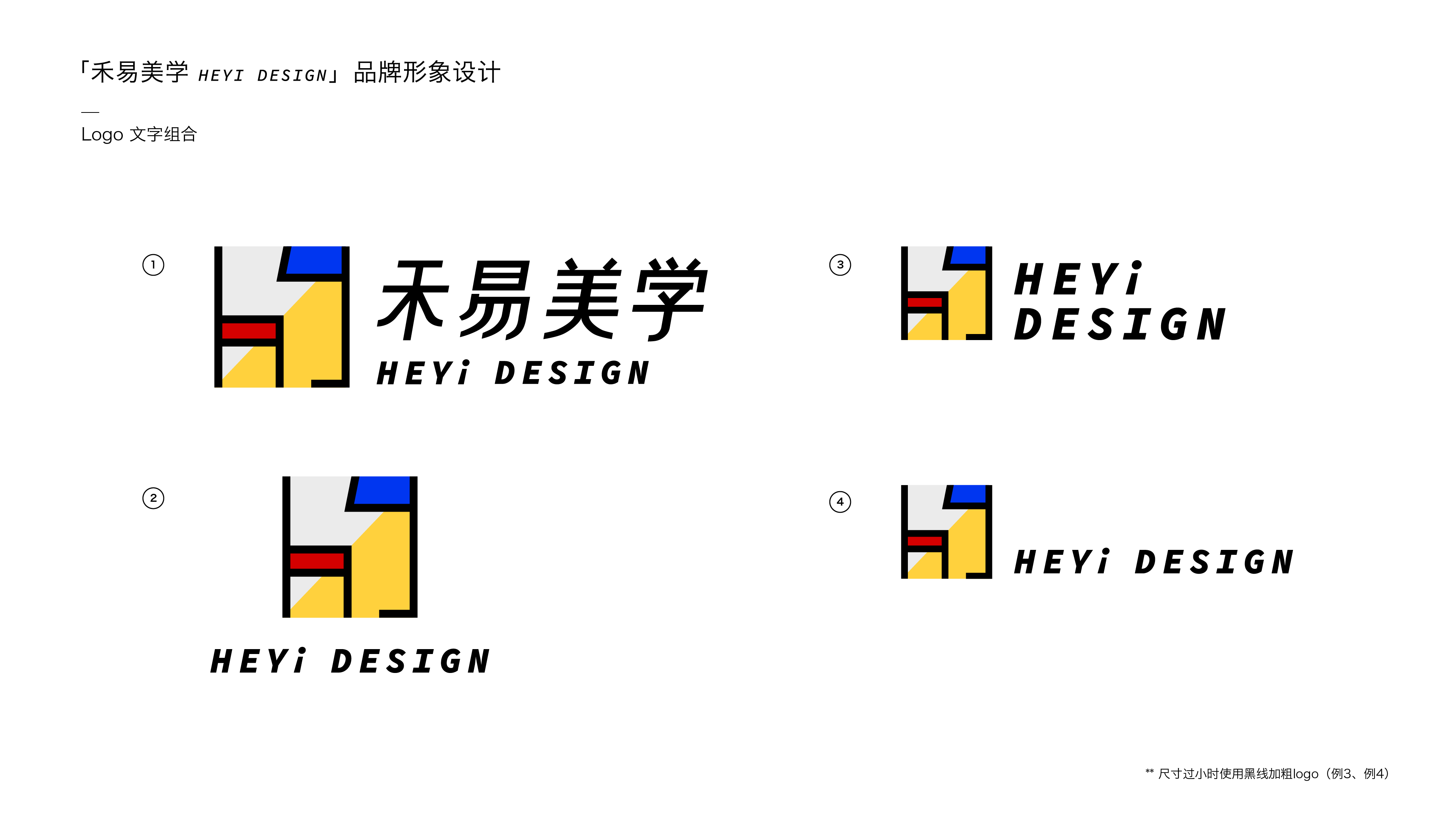
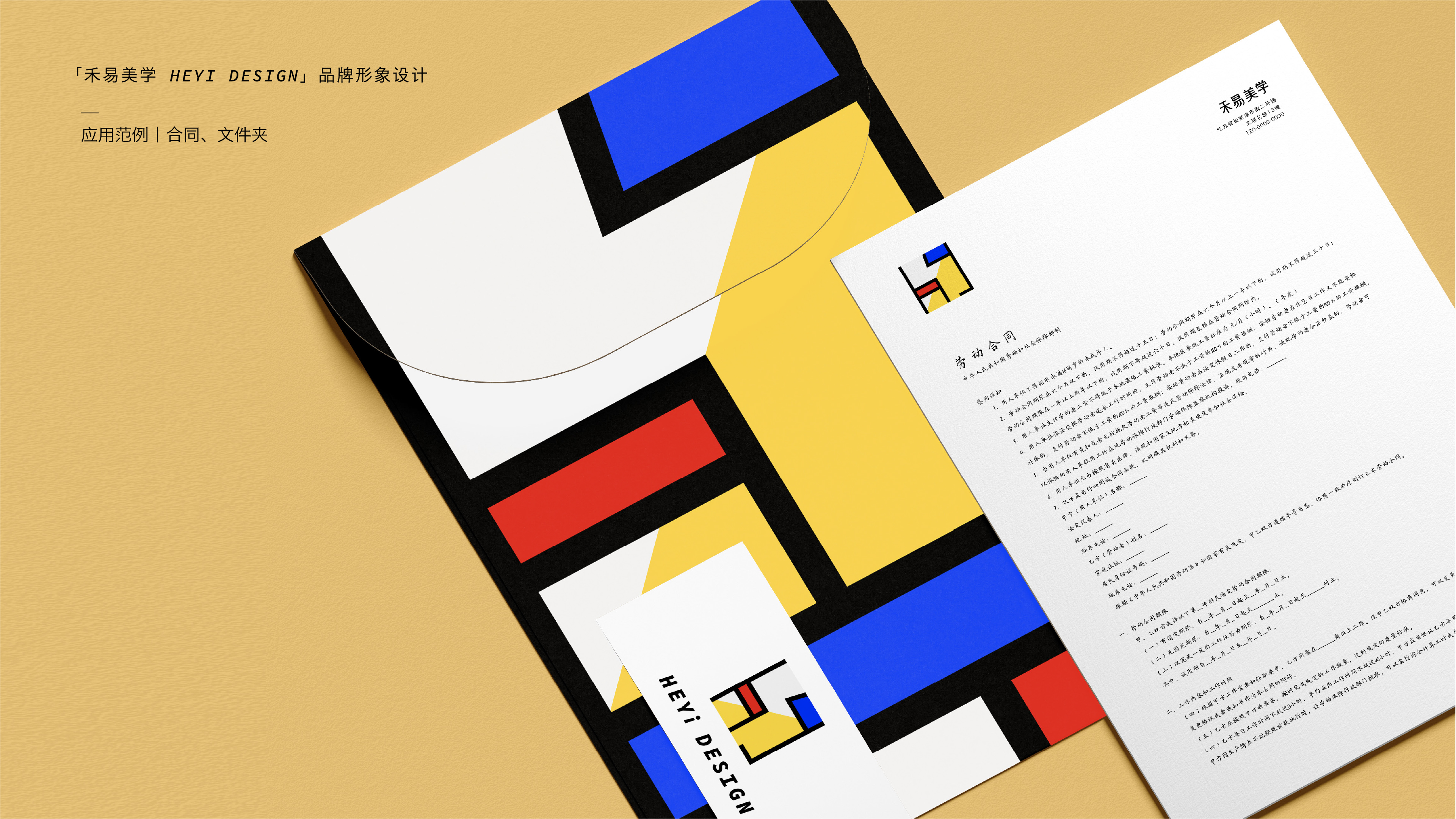
To modernize He Yi Design's brand, I drew inspiration from Piet Mondrian's art Composition with Red Blue and Yellow and used geometric shapes to create a graphic logo. The lowercase "h" resembles a chair, and the "y" resembles a floor lamp, reflecting the company's modern aesthetics and business category.
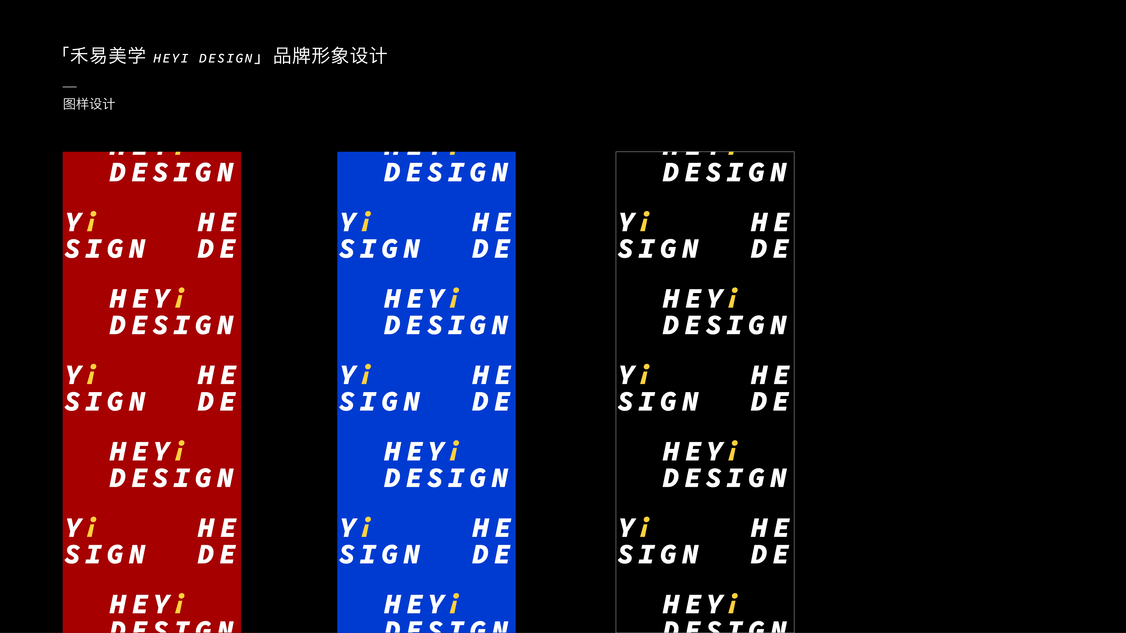
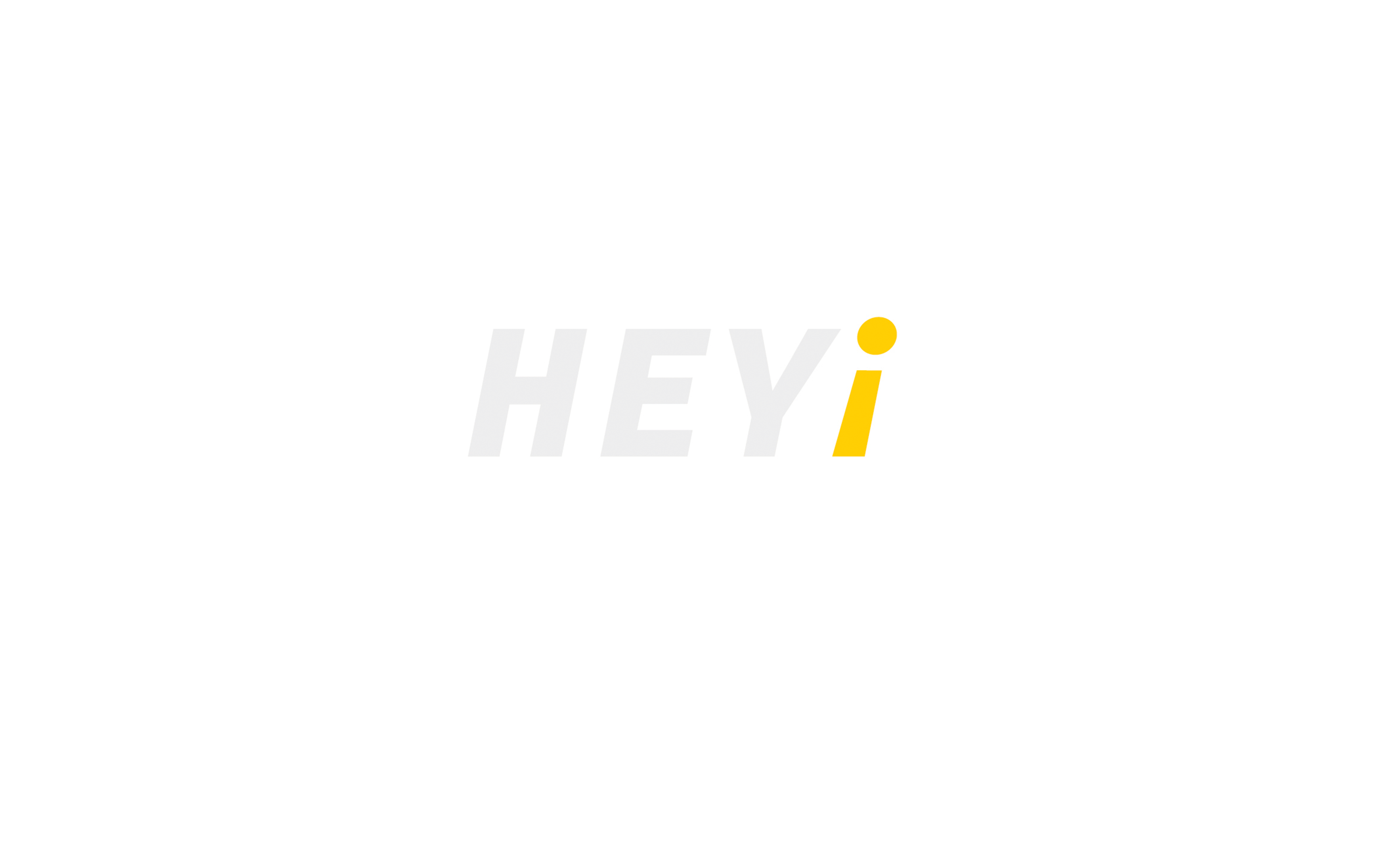
I transformed the English wordmark into "Hey" with an accent "i" that doubles as an upside-down exclamation mark, creating a bold and vibrant look that complements the new graphic logo.
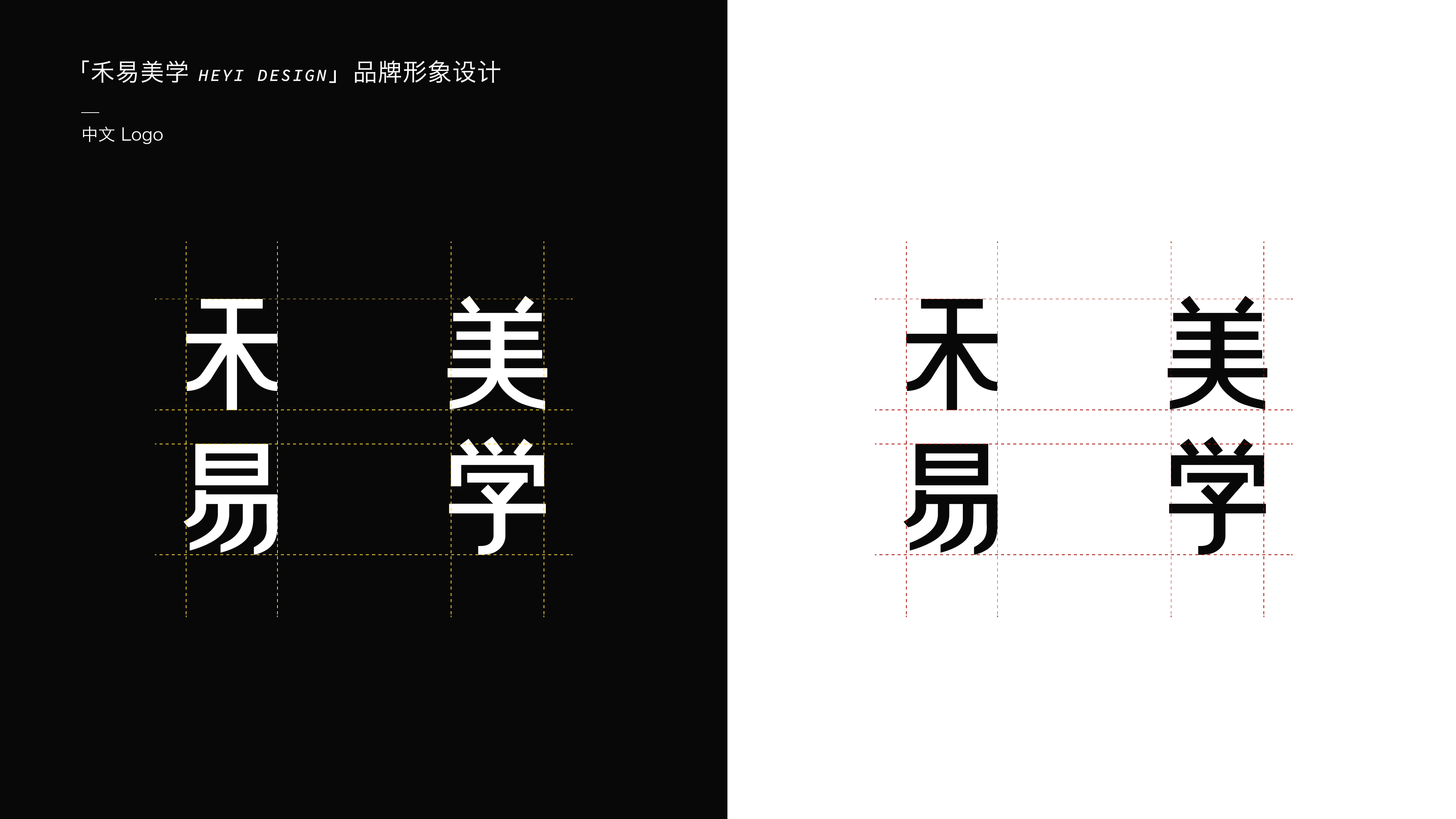
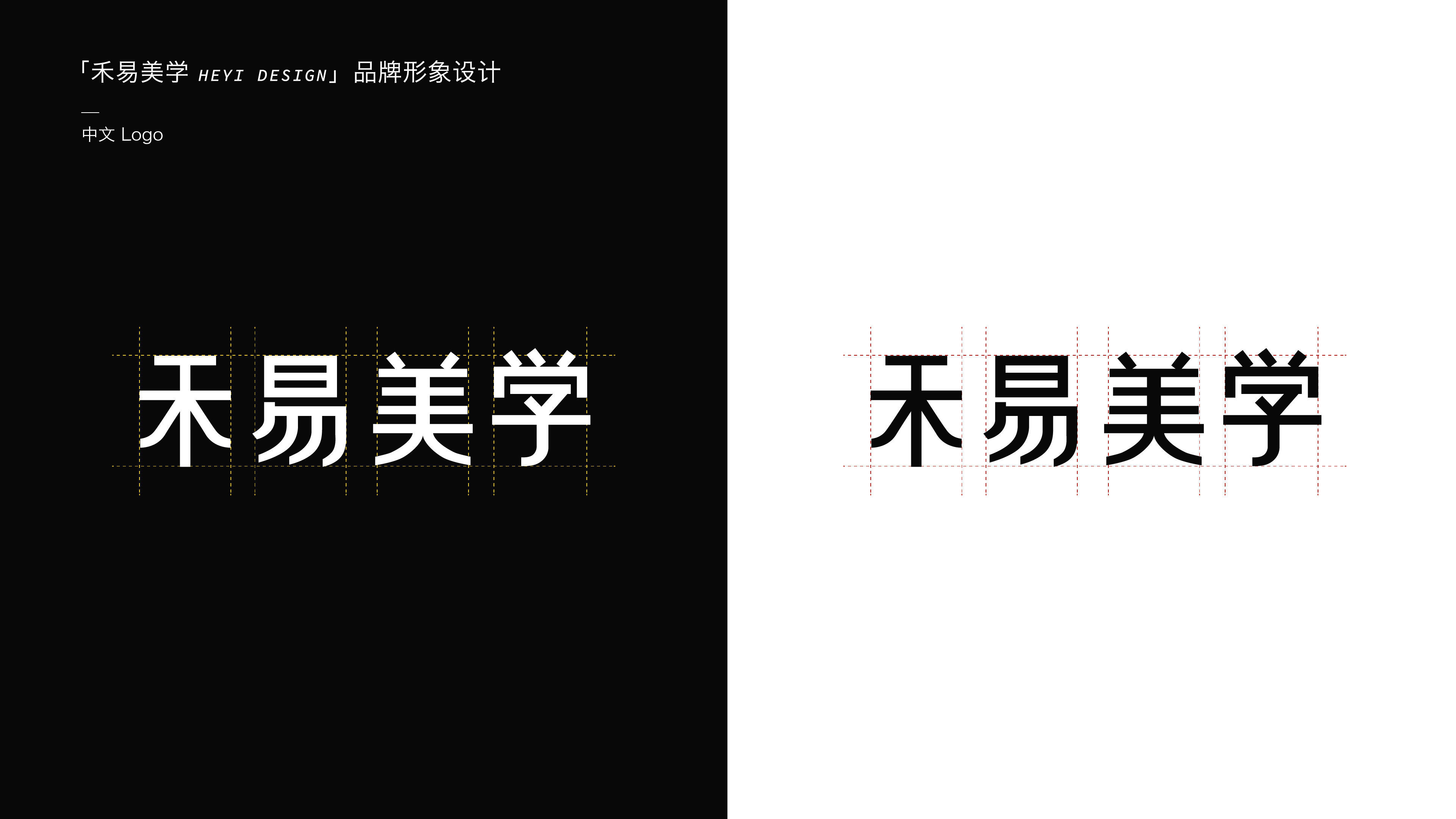
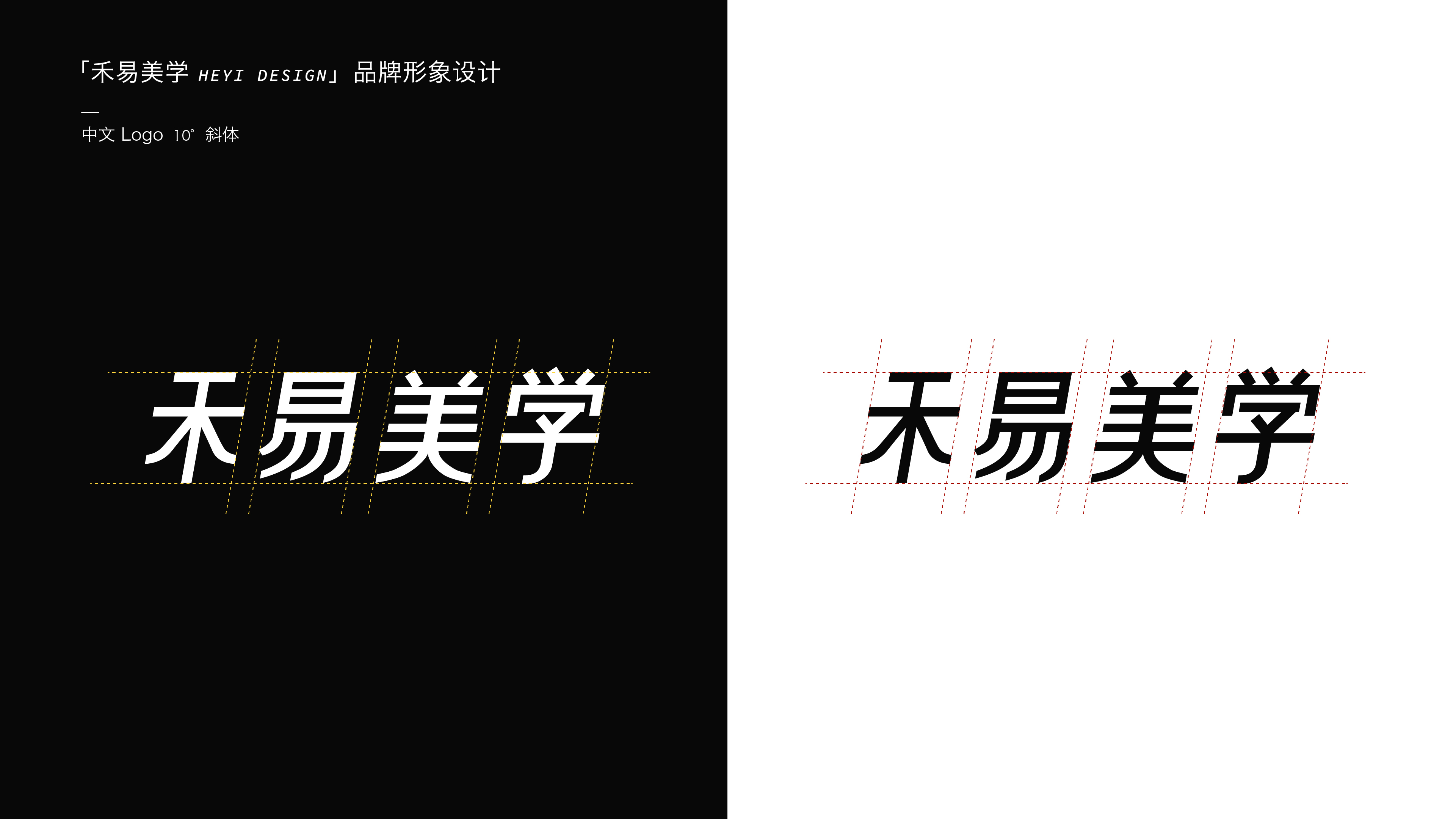
To maintain consistency, I also redesigned the Chinese wordmark to pair with the new logo and English wordmark.
Project Info
Time
2022
Client
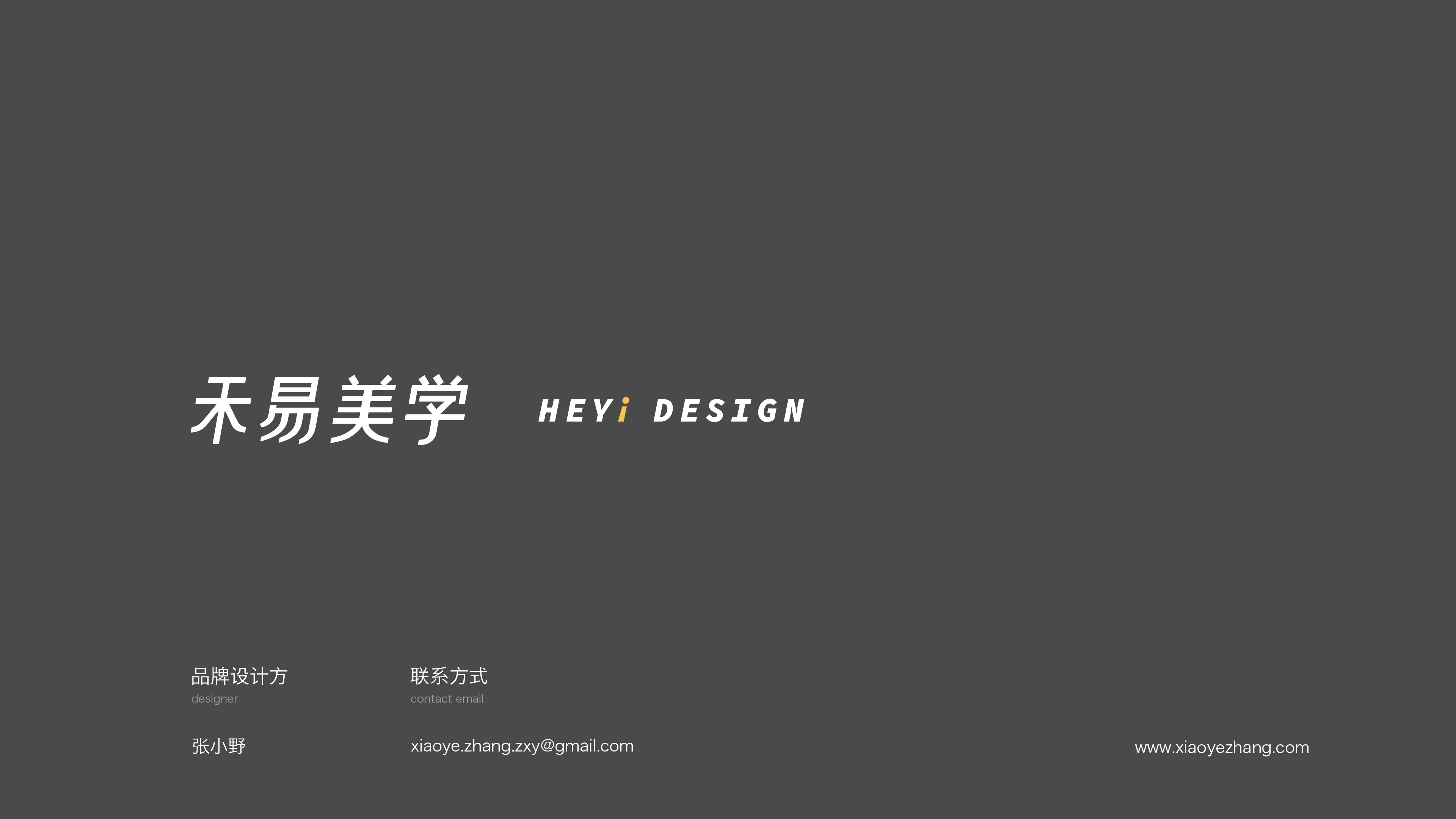
He Yi Design
Team Size
1 person
Role
Design
Xiaoye Zhang
Craft
Xiaoye Zhang
Tools
Software
Illustrator, Photoshop
Brand Manual